What is Typography?
Today, typography includes all processes involved in designing with type – regardless of the medium. This includes not only letters and typefaces, but also lines, white space, surfaces, proportions, hierarchies, and the interaction between text, images, and graphic elements.
At its core, typography is about designing text so that it is both functional and visually effective. This includes, among other things:
- selecting suitable typefaces
- defining font sizes and font weights
- using line spacing and word spacing effectively
- structuring content through clear hierarchies
- aligning typography, color, and format with the medium and target audience
Typography is therefore always a strategic design tool. It supports readability, orientation, and recognition – and directly contributes to the impact of communication.
Table of Contents
Typography: Definition, fundamentals, and its importance for strong brand communication
Typography is part of our everyday lives – on websites, in ads, on social media, in brochures, catalogs, and on packaging. It ensures that content is not only readable, but also understandable, well-structured, and aligned with a brand. That is exactly why typography is much more than choosing an attractive typeface.
The term comes from Greek: “typos” means form or figure, while “graphy” refers to writing. Originally, the term described the art of printing. Today, typography refers to the intentional design of type and text elements across analog and digital media. It influences how information is perceived, how quickly content can be understood, and what impression a brand leaves behind.
For companies, typography is therefore a key tool in product communication. It helps communicate messages clearly, structure content effectively, and create a consistent brand experience across all channels.
Why is Typography important?
Typography plays a major role in whether content is quickly understood, enjoyable to read, and perceived as professional. Even small differences in type choice, line length, or spacing can significantly change how a text is received.
Good typography:
- improves readability
- creates orientation in complex content
- supports brand perception
- conveys mood and character
- ensures consistency across channels
This is especially important in digital communication. On websites or landing pages, users have limited time and attention. Typography helps make content accessible quickly and visually reinforces the right tone of voice.
The history of Typography
Die Wurzeln der Typografie liegen in der Druckkunst. In der Frührenaissance wurde sie auch als „schwarze Kunst“ oder „deutsche Kunst“ bezeichnet. Gemeint waren damit die handwerklichen und drucktechnischen Prozesse vom Schriftentwurf bis zum Letternguss.
The roots of typography lie in the art of printing. During the early Renaissance, it was also referred to as the “black art” or the “German art.” These terms described the craft and technical printing processes involved, from type design to casting metal type.
A decisive turning point came with the invention of movable metal type. Johannes Gutenberg fundamentally shaped European written culture between 1400 and 1457 and made it possible to reproduce texts on a larger scale. Although earlier methods using movable type already existed, for example in Korea, the Latin alphabet made this principle much easier to implement.
With the printing of the Gutenberg Bible, typography became a milestone in media history. Over the following centuries, many type classifications and stylistic directions evolved further, including well-known Roman typefaces such as Garamond, Bodoni, and Caslon.
In the 19th century, sans serif typefaces were added. In the 20th century, industrialization, advertising, and later digital media transformed typography once again. With the rise of the internet, web and screen typography emerged. Typefaces such as Verdana were developed specifically for on-screen reading.
Today, typography naturally moves between print and digital. It must work just as effectively on paper as it does on smartphones, desktops, marketplaces, social ads, or packaging.
Macrotypography and Microtypography
Typography works on several levels. A basic distinction is made between macrotypography and microtypography. Both areas are closely connected and are essential to the quality of a layout.
Macrotypography
Macrotypography describes the overall effect of a page or interface. It addresses how content is structured, arranged, and weighted.
This includes, for example:
- page or screen format
- type area and layout grids
- placement of headlines, body copy, tables, and images
- line length and text blocks
- visual hierarchies
- white space and proportions
Macrotypography creates orientation. It ensures that content is logically organized and that users quickly understand what matters most. This is especially relevant in brand communication, because strong structure not only looks professional, but also improves user guidance.
Microtypography
Microtypography focuses on the fine details within the type itself. It determines how clean, balanced, and readable a text appears at the level of letters, words, and punctuation.
This includes, among other things:
- letter spacing
- word spacing
- tracking
- kerning
- line spacing
- ligatures
- small caps
- punctuation and its correct use
These details are often underestimated. Yet together, they make a noticeable difference: good microtypography improves reading flow and creates a high-quality, carefully considered overall appearance.
Serif and Sans Serif Typefaces
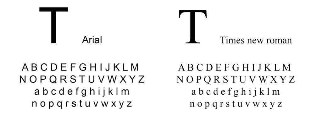
One of the most fundamental distinctions in typography is the difference between serif and sans serif typefaces.
Serif Typefaces
Serifs are the small finishing strokes or “feet” at the ends of letters. Serif typefaces often appear classic, refined, established, or editorial. They are traditionally used in books, newspapers, and magazines.
Their advantage is especially noticeable in longer print texts: the letterforms can appear more connected, which can support reading flow. At the same time, serif typefaces often convey a sense of tradition, sophistication, or character.
Sans Serif Typefaces
Sans serif typefaces do not have these finishing strokes. They often appear clear, modern, reduced, and direct. They are especially common in digital applications, interfaces, websites, and short, concise messages.
Their strength lies in their readability on screens and their generally clean, orderly appearance. That is why many companies rely on sans serif web fonts in digital environments.
Which type style fits when?
Whether a serif or sans serif typeface is the better choice always depends on the context. The decisive factors are the medium, target audience, content, and brand identity.
- For long reading texts in print, a serif typeface can be a good fit.
- For interfaces, websites, and short digital content, a sans serif typeface is often the better choice.
- In brand communication, combining both styles can also work well – for example, using a distinctive serif typeface for headlines and a clear sans serif typeface for body copy.
What matters most is this: type selection should not be based on appearance alone, but on how well it fits the message and the channel.
Typographic Terms
Anyone who works with typography will quickly encounter technical terms related to the structure of individual letterforms. This typographic vocabulary helps describe typefaces more precisely and better understand how they work.
| Stem | The stem is the main, usually vertical stroke of a letter. It forms the supporting structure of many characters and strongly shapes their basic form. |
| Hairline | A hairline is a very thin stroke within a letterform. It often contrasts with the heavier stem and is typical of typefaces with stronger variations in stroke width. |
| Counter | The counter is the inner space of a letter. It can be open or closed, as in the letters “O,” “P,” “B,” or “U.” The shape of the counter has a significant influence on both the appearance and readability of a typeface. |
| Descender | A descender is the part of a lowercase letter that extends below the baseline, as in “p,” “q,” “g,” or “y.” Descenders are important for the rhythm, spacing, and overall readability of a typeface. |
| Ascender | An ascender is the part of a lowercase letter that rises above the x-height, as in “b,” “d,” “h,” or “l.” Ascenders help shape the vertical rhythm of a typeface and contribute to its visual character. |
| Serif | A serif is the small finishing stroke at the end of a letter. It strongly influences the character of a typeface and is the central distinguishing feature between serif and sans serif styles. |
| Bracket | The bracket is the inner transition or curved connection between a serif and the main stroke. It is an important detail in the formal design of serif typefaces. |
| Ear | An ear is a small projecting stroke found on certain letterforms, for example in the lowercase “g.” Details like this often contribute strongly to the personality of a typeface. |
| Terminal | A terminal is the end of a stroke or letterform where no serif is present. It can be soft, pointed, rounded, or straight, and it shapes the visual character of the typeface. |
| Teardrop Terminal | A teardrop terminal is a rounded, droplet-like ending at the end of a stroke, often seen in letters such as the lowercase “a” or “g.” It is a characteristic detail in many classic typefaces. |
| Capitals | Capitals are uppercase letters. They are used deliberately for emphasis, acronyms, or headlines – but should be used with care, since text written entirely in capitals can reduce readability in longer passages. |
Typography in product communication and media production
Typography is never just decoration. It is a functional part of good design and plays a central role in brand communication. Whether on a website, webshop, social ad, catalog, packaging, or point-of-sale or out-of-home material, type must fit the brand, structure content, and work effectively across channels.
This is also where the connection to professional creative services becomes clear. Strong typography does not happen by chance – it emerges from the interaction of concept, design, content, and channel expertise. It must convey brand character, take technical requirements into account, and remain consistent across different formats.
As part of a holistic creative approach, Laudert helps companies think about typography not in isolation, but as an integral part of their overall brand presence – from digital touchpoints to traditional print media.
How can we support you?
Do you want to use typography not only correctly, but strategically for your brand communication? Laudert supports you in connecting content, design, and channels intelligently – from websites and landing pages to catalogs, campaigns, and other marketing materials.
Especially when typography is meant to become part of a consistent brand presence, it pays to look at the bigger picture: readability, hierarchies, design systems, and the channel-specific delivery of content.
FAQ about Typography
What is typography?
Typography refers to the design of type and text elements across analog and digital media. This includes, among other things, type selection, sizes, spacing, hierarchies, and the interaction with other design elements.
What is the difference between macrotypography and microtypography?
Macrotypography describes the overall design and structure of a page or interface. Microtypography refers to the fine details within the type, such as spacing, tracking, ligatures, or punctuation.
What is the difference between serif and sans serif typefaces?
Serif typefaces have small finishing strokes at the ends of letters, while sans serif typefaces do not. Serif typefaces often appear more classic, while sans serif typefaces usually feel more modern and clear.
Why is typography important for brands?
Typography plays a major role in how content is perceived. It supports readability, recognition, and brand impact across all channels.
Verwandte Glossar-Einträge:
Grafic Design · CMYK · Lithography